Translate Page

Even if you moved to the Left Bank, you'd never see the Paris that's onstage in Amélie, and that's entirely the point. Based on the Oscar-nominated French film from 2001, this new Broadway musical follows a young woman whose imagination imbues every moment with magic. Whether she's a child having conversations with her pet fish or a grown-up plotting an elaborate treasure hunt to meet a man she might love, she fills her world with skewed beauty.
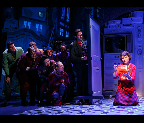
David Zinn gets to turn Amélie's fantasies into tangible objects. As the set and costume designer for the production – which is now at the Walter Kerr Theatre – he delivers a dreamscape version of the French capital, where oddly proportioned buildings lean next to stacks of furniture and where eccentric men in perfectly tattered clothes complement our heroine (played by Phillipa Soo) in her vibrant mix of reds. The effect is buoyant, and it clarifies the contours of Amélie's mind.
In a recent phone call, Zinn told me how he crafted his vision of the show. Here are the highlights from our conversation:
---
Mark Blankenship: Would you say it's an advantage to be designing both the set and the costumes? It gives you a lot of sway over how the production looks.
David Zinn: Well, when you do both, there's an ease to the conversation that the costumes and the scenery have. Not that that ease doesn't exist when you're working with somebody else. But in a thing like this, we're trying to capture the vibe of the film and its heightened use of color. It doing both, it was an easy tag team between when I put my foot forward as scenic designer with a big color gesture or when I put that foot forward with costumes and how they relate. It feels like the same hand is at work, in the way that in the movie you feel a very deep style.
MB: I love the phrase "deep style," which seems appropriate for what's happening. How would you define the deep style you're creating?
DZ: I'm not very good at defining things, but what we wanted to capture was a world that felt saturate and whimsical. And like the film is, we wanted it to be both heavy and light at the same time. All throughout, there's a trade-off between heavy gestures and light gestures, or heavy things treated in a light way. And not to get too deep, but we see the darkness of her world countered with the lightness of her spirit.
MB: Can you give me an example of a heavy thing treated lightly?
DZ: Yeah. You've got those two mountains of furniture [on the sides of the stage]. We've made this exterior world out of interior things, in a way, and they're clunky piles of furniture. But they're treated in a way that keeps them light. And also, Peter [Nigrini, the projection designer] and Jane [Cox] and Mark [Barton, the co-lighting designers] have kept the world feeling delicious, like candy. It's like when we have a thirty-foot, naked-lady neon sign come in. She feels like a light gesture, even though she's a massive gesture. She's enormous, but she comes in with a wink.
MB: Yes! I definitely felt this production was aware of the darkness in Amélie's world. We know she's lonely and often afraid to even talk to people, but we also know she's got this wonderful inner life. And it seemed like because the design was allowed to be so cockeyed, with unusual proportions and colors and stacks of furniture, the darkness wasn't allowed to win. The darkness was present, but it wasn't everything.
DZ: I don't like to control people's responses to my work, but I really appreciate that it spoke to you that way. And that speaks to Amélie as a wonderful character. She speaks to many people who come to a big city and feel like weirdos and are trying to find a place in the world.
MB: I also saw that in what she wears. She's mixing all these shades of red and mixing all these patterns, and it feels really vibrant and powerful. Can you talk about where her look came from?
DZ: I wanted the strength of a single color, and originally there wasn't so much pattern in it. But when we were in L.A., she had a plainer skirt on. And I thought, "Well, she looks cute, but I could make a better statement." And now her look feels really right. Which, p.s., she just entirely coincidentally happens to have the same love of pattern mixing that I do.
MB: Well, that's lucky!
DZ: It is! And it felt like a fun way to express her funkiness. I love the grunge-y, punk rock-y plaid. I love her big, crazy boots. And Phillipa carries it really well. It's a great place for her to live.
---
TDF Members: At press time, discount tickets to Amélie were available. Go here to browse our latest offers.
Photos by Joan Marcus. Top photo: Phillip Soo (right) and the cast of Amélie.
Follow TDF Stages editor Mark Blankenship at @IAmBlankenship. Follow TDF at @TDFNYC.